Moving Toward the Future, Part 3: How Traditional Small Creative Agencies Can Re-tool for the Digital Era – New Appreciation for IT Staff

Submitted by Sam Moore on Wed, 09/02/2020 - 12:29

Image
IT Staff

In traditional creative agencies, IT staff have almost been a second thought. Programmers, coders and similar employees were viewed mostly as a pair of hands to execute on the agency’s main value proposition: creative ideas. But in a digital-first world in which a constantly growing mound of content is king, it has become at least as important to make sure experienced, knowledgeable IT pros are present when the paper is blank, at the beginning of any campaign.

These people must be present not only to advise accurately on which concepts can most easily and inexpensively be implemented digitally, but also to vet creative assets such as websites and apps for all-important characteristics such as SEO ranking, cleanness of code and loading times.

Another critical task such IT personnel will fulfill is testing deliverables. Testing everything from links and pop-overs to mobile responsiveness must be built into new digital-first processes by people who understand the nuances of the work, and when such testing is most effective. Ensuring that these folks are integral members of the team will keep you competitive and give your projects the best chance for success of your campaigns…and your business.

Moving Toward the Future, Part 2: How Traditional Small Creative Agencies Can Re-tool for the Digital Era – Overcoming Tech Differences

Submitted by Sam Moore on Sun, 08/30/2020 - 10:22

Image
Online meeting on laptop

At least up until the arrival of COVID-19, few small creative agencies typically worked remotely. They generally built their processes and workflows around in-person meetings with clients, staff and vendors, with a possible phone call or rare online meeting thrown in when deadlines came down to the wire.

Not only did this tend to make the work process more cumbersome and expensive, it also slowed it down. Because digital-first agencies tend to be built by highly tech-savvy principals (if not downright tech nerds), their foundations include the use of communication, project management, and brainstorming software such as Basecamp, Slack and MindMeister to allow most—if not all—of these processes to happen virtually.

Though it may remove some of the more personable aspects of business, these types of software packages can help today’s traditional agencies retrofit their processes to be able to compete with their digital-first peers.

Moving Toward the Future, Part 1: How Traditional Small Creative Agencies Can Re-tool for the Digital Era – Volume and Velocity

Submitted by Sam Moore on Tue, 08/18/2020 - 18:07

Image
Digital marketing laptop

Small creative agencies tend to have small client rosters, having chosen to remain small so they can stay in the creative end of what they love to do, rather than become managers. This translates to not being able to service the work volume and production velocity of larger agencies.

Digital-first agencies are built on a high-volume, constant-output type of project. The many different channels of digital marketing require the production of large numbers and many sizes of banner ads, social media and blog posts. Consequently, these agencies tend to have grown up at a pace far more intense than traditional agencies have experienced.

Happily, this can be remedied by supplementing salaried staff with freelance talent from a newly robust pool of freelancers, thanks to COVID-19. As a bonus, they can be chosen for narrow specialization in any needed discipline, providing previously hard-to-find expertise for any size agency or client.

Website User Experience Optimization Tactics – Design Convention Examples

Submitted by Sam Moore on Fri, 08/07/2020 - 16:31


Image
Landing page design

In our last post, we explored why using accepted Web conventions helps create a positive user experience for site visitors. Here, we will talk about some specific examples of such conventions.

Though it’s nowhere near an exhaustive list, here are ten important conventions that have survived the last 20 years or so, and that we still use today. Again, they’re not unbreakable laws, and there are plenty of sites that don’t follow them. But the majority of intentionally designed sites do stick by them, because they simply work.

  • Brand logo in top left corner of every page. Graphically designed websites originated in English-speaking countries, and since we’re top-to-bottom, left-to-right readers, this placement at the beginning of each page makes sense as a branding device. Because this repeats on all pages, it usually becomes part of a page template in CMSes.
  • Contact information in top right corner of the page or top menu bar. This is not always the location, but it has been often enough to be considered a convention. However, more recently the Contact location seems to be migrating down into the footer on many pages. This is likely because Contact information is considered more “boilerplate” type content, and not brand- or sales-critical. Generally, the latter is considered more worthy of such prominent screen real estate as top right corner.
  • Main navigation across top of page. Nearly 90% of websites use this convention for the location of their main navigation bar. Again, it makes sense: It's the first thing you see, which is good, since it helps you get around the site.
  • Automated slideshow on the Home page. About a third of current websites use this slideshow (or carousel) on the site’s landing page. It’s a more recent convention, since it hasn’t been all that long that this functionality has been available. The slideshow does appear to be evolving into a single, static hero image as more minimalist, static sites become in vogue, but that’s still in flux.
  • Value proposition “above the fold” on Home page. 80% of websites place a clear promise of their value in the top half of the home screen.
  • Call to Action high on the Home page. Almost as many place a call to action in a visually prominent place on their Home pages.
  • Header search feature. 54% of websites have a search feature somewhere in their headers, but almost half of all marketing sites don’t have a “globally” appearing search function on every page. Others have one, but relegate it to a position in a left- or right-hand sidebar.
  • Signup box. 24% of websites provide a place for visitors to sign up for email updates or subscribe to a newsletter in the footer. That doesn't represent enough compliance to be a convention, exactly, but it is common. A position becoming more popular for signup boxes is a pop-up or pop-over box that appears soon after a visitor enters the site.
  • Footer-located social media icons. With a whopping 72% of websites locating their social media presence icons in the footer, that goes so far beyond being a convention, it’s almost a standard practice. Of the remaining 28%, only 2% don’t locate their social media icons in the header, making that a distant second in positioning for these symbols.
  • Responsive design. An overwhelming number of people are now accessing the Web via mobile devices instead of desktop screens. In fact, as of Q2 2018, 63% of all retail website visits were made on a smartphone. This is even more true for developing countries, whose populations skipped over the desktop/laptop stage and went direct to mobile devices as Internet access and smartphones came to their regions. However, a study by Appticles, published in 2017 in Smashing Magazine, stated that the percentage of all sites that are responsive was at just 52.11%. That could be accounted for by the recent explosion in sheer volume of sites since consumer-level content management systems became ubiquitous, as well as the number of sites that were aging and not being maintained. Regardless, it's definitely a convention that should be followed by anyone creating a new website from this point forward.

Image
Websites on multiple devices

Other conventions we would recommend in addition to these include such things as

  • Terms of Use and Privacy Policies in the footer
  • making sure you offer a sitemap as part of the navigation, and
  • offering social sharing buttons on any content that may be deemed shareable, especially blog posts and newsroom features.

There are plenty of other conventions, as well as some usage models that have at least become trends, if not yet conventions. Here’s a great article on the difference, and why that’s important.
Next time, we’ll take a look at specific design elements that can help you create a pleasing website user experience.

Website User Experience Optimization Tactics – Design Conventions

Submitted by Sam Moore on Tue, 07/28/2020 - 18:16

Image
Positive user experience on your website

In our last few posts, we discussed the importance of creating a positive user experience (UX) on your website. This time, we look at one of the ways to do that successfully.

One given is that each visitor arrives at your website with something they hope to accomplish, even if that’s just getting to know you and your business or organization, if they happen to land there unintentionally. Your job is to help them fulfill that goal by making it easy to use your site.

There are many methods and tactics for creating an optimal UX, and what works for one project may not work for another. That’s why UX design is never a one-size-fits-all gig. However, there are some broad tactics that work pretty much across the board, before you get really granular about any specialized functionality for a particular site.

The first of these is to employ accepted Web conventions.

Image
User experience on the phone

The Internet, in the form we’re familiar with, really started in 1989. Before that, it was really a network of electronic Bulletin Board Services (BBS) with just text and a command-line structure. But with the rise of more robust graphic page description language, the World Wide Web of today was born. Of course, it was a lot more primitive back then, and anyone remembering those days of hand-coded Gen 1 sites won’t miss it at all. But over the years since then, as HTML and PHP and CSS became more fully featured and powerful, certain conventions have evolved.

Because they did evolve organically, through repeated user preferences, they have stuck; unlike rules imposed from without, which may or may not have been useful enough to stick around. Like subway signage or road map symbols, these conventions are tacitly agreed upon and recognized by frequent users. Every so often, some freethinking, creative individual will come up with simpler or more useful versions of these conventions that they will tweak and then the new version catches on. But by and large, most of these conventions are time-tested and exist because they work.

In our next installment, we will look at specific examples of successful Web conventions that can help your site provide a positive user experience.

User Experience and Why It’s Critical to the Success of Your Business or Organization

Submitted by Sam Moore on Mon, 07/27/2020 - 19:01

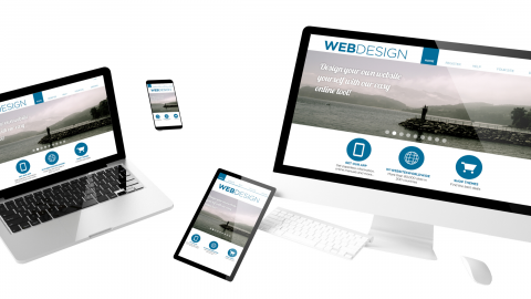
Every firm serious about business has a website by now. It may be of varying degrees of depth and complexity—from a simple landing page or blog to a full-blown eCommerce site—but if the company or organization sincerely expect to leverage the most active marketplace in the world, they have an Internet presence.

But maybe that presence was created a while ago now, or perhaps by people who really weren’t savvy about what really works for what you’re trying to accomplish.

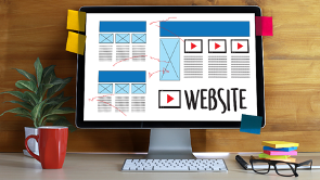
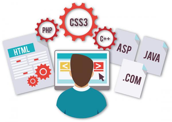
There is a whole palette of tactics to choose from these days. The Web has matured and site-building tools have evolved to allow far more user-friendly interfaces than the original HTML site creators. But if you don’t know how to use those Content Management Systems, or you know the basics but need help with the finer points of structure and functionality, it’s possible that your site isn’t being all it can be in service to your online goals.

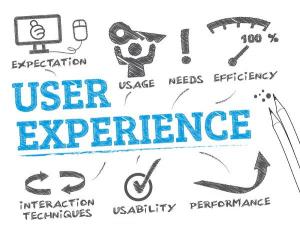
It may be time to bring in a consultant that specializes in web development. Or maybe you just need some help understanding one of the key design components that will either make or break your website’s effectiveness as a marketing and/or sales tool: User Experience (UX).


User Experience is important to everyone.

Whether you want to sell a product or service, garner a constant stream of eyes to build your brand, or simply provide a steady stream of information about a specific topic, you still need to make your site easy to use. And if it’s not, all you have to do is check your Google Analytics reports to figure out why. (You are using, analytics, right?)

You may discover that people are coming to your site, but not staying long. Perhaps many of them leave from a certain page repeatedly, and never come back. Or they're visiting your storefront, but not buying.

Whatever the specific reason, it all adds up to the fact that they didn’t have a great experience on your site, so they’re not going to reward you with their time, attention, and dollars. They have plenty of other places to go online—1.72 billion sites, at the time this was written—and they WILL find those that engage, delight, and reward them with an intuitive and pleasant user experience.

Just like the building of your site, building and maintaining an engaging user experience is not a one-time effort. Yes, there will be the major build and launch, but then you can’t just put it on the back burner. Because Web conventions and trends change with available technology, user experience is not a “fix-it-and-forget-it” deal.

So, what does it mean to build and maintain a good one? First, we have to understand the definition of UX.

What does “User Experience” really mean?

User experience is such an important part of a website, that is has its own website at the U.S. Department of Health and Human Services. Usability.gov is the leading resource for UX best practices and guidelines. It serves practitioners and students in the government and private sectors. The site provides overviews of the user-centered design process  and various UX disciplines. It also covers related information on methodology and tools for making digital content more usable and useful.

This site defines UX as focusing on “having a deep understanding of users, what they need, what they value, their abilities, and also their limitations. It also takes into account the business goals and objectives of the group managing the project. UX best practices promote improving the quality of the user’s interaction with and perceptions of your product and any related services.

Peter Morville, an information architecture and findability expert, created the User Experience Honeycomb to represent the desirable qualities in a website:


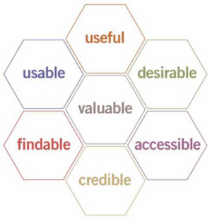
According to this paradigm, in order for there to be a meaningful and valuable user experience, information on your site must be:

Remember, whenever you publish a site on the World Wide Web, you are making an implicit promise to your visitor: that the time they spend there will be worthwhile. In the big scheme of things, you can theoretically make more of anything except time, so not delivering on that promise is theft of an irreplaceable resource, and once you disappoint a site visitor, they won’t forget that theft.

So you need to deliver a good UX, which means:

  • Useful: Your content should be original and fulfill a need.
  • Usable: Site must be easy to use.
  • Desirable: Image, identity, brand, and other design elements are used to evoke emotion and appreciation.
  • Findable: Content needs to be navigable and locatable onsite and offsite.
  • Accessible: Content needs to be accessible to people with disabilities.
  • Credible: Users must trust and believe what you tell them.
  • You somehow attracted a visitor to your site.
  • The visitor scrolled through at least more than a few of its pages.
  • They understood what your site is about.
  • They found something of value there and were satisfied it was worth the time they traded to be there.

Why Concern Yourself With Improving UX?

It’s a simple concept, really: If you keep people happy, they’ll be more responsive to what you wish them to do. So if you make their experience using your site easy, pleasant, maybe even fun, they’ll stay longer. If they stay longer, they’re more likely to develop good feelings toward what you offer, and to take the action you want them to take.

In business, this means visitors converting from prospects to customers. For organizations, it means visitors becoming members or subscribers or volunteers.

There is one simple concept that professional Web developers use to make this happen: They attempt to remove every possible obstacle between the visitor and what they want the visitor to do. This is called “reducing friction,” because friction occurs in physics whenever something exerts unwanted force in the opposite direction from where a body is intended to move.


No One Likes Friction

“Friction” on a website can be caused by a number of things, all of which add up to the total UX. It’s probably easiest to illustrate this point with an example:

Make It Customer-Centric

Now, with all the other things that could put your visitor off, doesn’t it just make sense to make sure the things that are within your control are as bulletproof as possible? And it’s not hard to do: Mostly, it’s just common sense, and it begins with putting yourself into the user’s shoes.

Here are a few examples of things that could end up happening with your design, and could cause a visitor to leave:

  • Imagine that someone is surfing the Web, and lands on one of your blog posts. This is their point of entry to your site, one of many ways they might have gotten there.
  • Having read your post, they decide that you know what you’re talking about. They want to learn more about how you gained your expertise, so they visit your About page.
  • Impressed with your experience, they move through some of your other pages. The topic interests them, so they keep reading.
  • At some point, they are presented with a subscription form that offers exclusive content such as a special report or downloadable eBook, in exchange for their email address.
  • They sign up and enjoy the content you provided.
  • A few days later, you send them an email welcoming them to your community. It contains an offer for an online video course on your topic. There are two possible choices they could make:
  • They sign up for the course because they like its description, price, and the time it takes to complete.
  • They don't sign up because they don't like one of those things, or because of a UX element that put them off. This could be anything from a disturbing image to an arrogant quote from you, or any number of other things.
  • Visitor arrives, and is immediately bombarded by a bunch of flashing, blinking eye candy that serves to confuse and disorient, rather than attract and help. Yiy! Nope!
  • There is no strong branding, headlines or copy to let the visitor know what the site is about. Buh-bye.
  • :: Visitor clicks a button :: “Wait, that's not a button. It looks like a button. I don’t get this site.” Poof!
  • (Here’s a pet peeve of mine): “I’m not quite sure about something on this site, but I’m interested enough in what it offers to make a little effort. I’ll just contact the site owner. But where the heck is the contact info?” :: disgusted sigh :: I’m outta here.

This is exactly the opposite of a good customer experience, so there’s a very good chance that not only will that user never become a customer, they may disparage your site to friends and colleagues. You’ve now caused damage where your job was to create goodwill.


Test, Test, Test!

To make sure that never happens, you MUST design around the user. To be sure that’s what’s actually happening and not just what you think is happening, at all points along the process—from wireframing to final launch—you need to test, test, test.

Lots of things work on paper or in theory, but once put into actual practice, unforeseen problems can arise. And the only way you can do that is to try it out as you build it. Testing should just come at the end, but all along the way, so that when a problem does arise, you can nip it in the bud, before it begets a bunch more issues.

In our next post, we’ll explore more about the actual UX design process, and some proven tactics to avoid the potential minefield of poor UX.

TechSpread: Staying Ahead of the Curve

Submitted by Mary Shafer on Thu, 10/31/2019 - 11:14

As with every successful small business, Resonetrics is evolving with its marketplace. We have always specialized in helping small to midsize businesses leverage the power of new technology in their marketing. Now, with the spread of technology throughout the business world, we find ourselves moving toward a more solid niche, with a slightly different focus.

Forging A New Path
One of the influences on this focus is the fact that we’ve been working with larger organizations. We believe this is due to the fact that larger, enterprise-level clients are catching up to the need for a deep, rich and highly interactive online presence in today’s fast-paced world. 

There have only been just so many of us out here, staying ahead of the curve in testing, evaluating and implementing new technologies for these companies’ marketing staffs. We believe our results have gotten the attention of these larger clients, and they have been reaching out to us here at Resonetrics. They seek help in moving forward into the new age of “Web-as-central-hub,” rather than as an afterthought or adjunct to traditional marketing with print and broadcast promotion. 

With this evolving marketplace, we now find ourselves again out in front, sharpening our service focus as the needs of our clients change. They have discovered that not only does the Web serve best as the hub for the many spokes on their marketing wheel, but also that—with the proper back end—their websites can and must integrate well with other enterprise functions such as administration, recordkeeping and internal communications. 

They’ve also come to embrace the idea that good marketing aims at two audiences: external consumers and internal stakeholders, including employees and management. The work we do has morphed to accommodate this reality, which has frankly always been the case. We're just glad this level of client is finally realizing it. It helps us help them far more effectively.

Technological Darwinism
To ignore the power of this integration—because it can be difficult to implement—has been the standard for many, if not most, businesses until now. But at this point in the growing sophistication of the consumer marketplace, it is simply not an option for those who want to remain in business. As in the natural world, those who can't or won't evolve do so at their own peril. 

But the reality of how quickly and completely technological evolution plays out can strain even the most well-organized and resourced businesses and groups. Their main challenge these days isn’t getting their websites launched and functional, though that remains a significant effort. 

The real obstacle is finding a way to task existing employees with maintaining the freshness of their site’s content once it’s launched. Without constantly refreshed content, websites plummet rapidly in search engine ratings, and give visitors little reason to return. This dwindling engagement shows up directly on the bottom line. The emergence of tools to accurately and reliably track such changes is one of the factors driving the evolution we've described so far.

Implementation Is Key
Up till now, typically the corporate website has been an afterthought in the priorities and schedules of already harried marketing departments. Staff who have been trained mainly in the daily activities traditionally associated with their service or product specialties found themselves pressed into service as digital content managers and/or social media managers. But as more and more businesses, institutions and organizations realize the power and immediacy of websites as a 24/7 information bank and sales representative, they recognize that they must allocate dedicated resources to keep their sites viable. 

They have begun tasking people to manage this constant flow of content. This means employers have their hands full, trying to deal with some inevitable resistance by those being pushed out of their comfort zones, into tasks that likely didn't even exist when their original job descriptions were written. Other departments, perhaps longer in the game and more experienced, are creating new job titles and descriptions in recognition that the Internet has proven not to be a fad but likely the most powerful marketing and operations tools ever invented.

Either way, there is a ramp-up to developing acceptance by all staff involved, and that’s a cultural issue. Here at Resonetrics, we certainly find ourselves dealing with it on a close basis. While we don’t get directly involved with the development of staff and new attitudes toward technology in the workplace, it does affect our work. We help these clients with both new technology acceptance, and with identifying and implementing solutions to the very real and immediate technological challenges of this situation.

Next Time: The Internet Evolves
 

Resonetrics: A Friendly Tugboat to Guide Your Ship to Open Horizons

Submitted by Mary Shafer on Thu, 10/03/2019 - 18:48

Last time, we discussed the rise of the Content Management System (CMS) as a tool to allow businesses to retain control of and access to their own websites on a timely basis. This post will describe how we are responding to this evolution in creating and maintaining a professional, useful online presence.

Enter Resonetrics
At Resonetrics, our challenge is to empower our clients not just to produce, but to regularly—and with as little effort and as few resources as possible—publish their own online content at a professional level. It has become part of our job to help them take ownership of their corporate voice in the world’s busiest and most densely packed information pool. And that’s the new era we’re kicking off with this post.

In concrete terms, what does this actually mean?
First, we take stock of the specific problem to be solved. We’ve thought a lot about it, and based on our experience, we think it comes down to three basic issues:

  1. Content organization & preparation – If it’s being done right, every organization’s website content consists of material provided from across the breadth of their expertise and knowledge. This means a variety of voices, language usage, tonal approaches, visual design and image types are being submitted by various contributors from all departments and sectors of the organization. It’s critical that this disparate content is well-edited and organized to shape it into a cohesive, single brand voice for the client. This is a skill set unto itself. Not everyone has it, but everyone can learn enough to ultimately execute at a higher level.
  2. User interface design – Regardless which CMS people use, unless they are dedicated content managers, they are usually administrative professionals primarily responsible for other activities more traditional to their jobs. This means that website content updates are basically just another load on their plate, which needs to get done at whatever frequency is called for. If their experience with the CMS they’re required to use is difficult, stressful and unrewarding, they will reject it. If you notice a strong resistance to this task in your organization, we’re probably talking about you. Part of our job is to identify the collective wisdom already accumulated to date around this issue, and leverage it to prescribe specific strategies to successfully deal with your particular situation. We do that both in individual consults and here on our blog, as appropriate.
  3. Corporate culture – All the best editing and technology design in the world cannot overcome a bad attitude, from organization management to the content manager. We may all indulge in a joke now and then about how fast the world is moving, but the reality is that technology acceptance is no longer solely the realm of the resident geeks and nerds. It’s imperative that everyone involved in dissemination of marketing content get on board and, if not actually embrace the new way of doing things, then at least accept and not resist it.

Tools Change, But The Mission Remains
A hundred years ago, wagon builders and harness makers, blacksmiths and wheelwrights all thought they were in the business of manufacturing their little piece of the huge horse-drawn conveyance pie. But then along came the automobile, and they had to decide if they were in their specialty business, or if they were in the larger transportation field. 

Those who decided the former either retired, took their former trade into hobby status, or ended up going out of business altogether. Those who recognized the larger picture stayed in business and thrived in their new part of it. That's why, for the longest time, Fisher Bodyworks still used a carriage as its trademark, paying homage to its humble beginnings. Massive brands such as General Motors carried that logo on their vehicles well into the 1970s.

But rest assured, GM continued to modernize until, along with other American car makers, it held on too long to the old manufacturing models. It was beaten out of its top spot by foreign car makers who weren't invested in history, but in the future. Those victors still lead auto makers today, while the “Big Three” American companies—who pioneered modern vehicle manufacturing processes—continue to struggle to find their place in the highly robotic, overwhelmingly technologized global industry.

Get Proactive or Perish
It’s the same now for every modern organization, whether commercial, financial, institutional or nonprofit: Master the technology, or it will surely master you. 

At Resonetrics, we’re embracing technology and staying out ahead of it, so our clients can concentrate on what they do best. They trust us to thoroughly grasp its implications and lead with this bold vision, so they can feel confident in the direction we’re helping them move. 

In return, we ask only that they respond with open minds and a willingness to try new tools that will smooth the path ahead for us all.

In future posts, we’ll be diving deep to address myriad facets of the three issues listed above, as they relate to discovering, formulating and helping you implement best practices in these areas. We invite you to forge ahead with us into a future that may not look a whole lot like the past, but whose promise is great. 

We need only remember that however uncomfortable it may be to venture out of our comfort zones, a ship is safe at harbor…but that’s not what ships are for.
 

CMS Platforms: Customers Take Back Their Sites

Submitted by Mary Shafer on Thu, 10/03/2019 - 16:59

In our last post, we discussed how the rapidly increasing adoption of workplace technology and the Internet’s integration with marketing and daily operations has been driving a change in our focus as consultants.

This time, we’re taking a look at exactly how that evolution has taken place, and what it means for our clients and the larger marketplace.

Internet Leaves Adolescence Behind

Typical “generation one” or “Gen1” websites, built sometimes manually or with steep-learning-curve software, dominated the Internet for at least its first popular decade. It’s safe to say that the majority of these sites have likely seen several iterations since they were first created. 

Usually, this has consisted of improvements to their front end appearance and underlying code—whether that was straight HTML or a hybrid HTML/SQL or some similar mashup. For many years, this was accomplished using similar tools to those used on original site builds. But pushback from clients who demand 24/7, responsive control over their websites has, in the past few years, triggered complete redesigns and builds using the far more accessible platform of a content management system or CMS. Think WordPress, Drupal or Joomla.

These CMSes were developed in response to the clamor for at least reasonably easy-to-update websites, using inhouse resources. It’s an understandable desire: No one wants to be at the mercy of an outsourced provider’s availability, especially when needed changes are urgent…which they can frequently be. 

Website owners also want greater control over costs, which can be on the high side when having agencies or other high-skill providers making their changes. It’s better to be able to pay once for the higher-skill structural, design and navigation elements up front, then hire lower-cost content managers to maintain the sites.

Content Management Platforms To The Rescue
CMS platforms have fulfilled that need, to a great extent. However, as their name implies, what site owners can change easily with these tools is basically content, nothing truly structural that would require knowledge of coding.

Though content—and not the container framework—is primarily what clients need to be able to change, the operational phrase here is “reasonably easy to use.” As web developers and coders ourselves, we recognize that learning even the skills needed for relatively low-level content management is—if we’re brutally honest—not always that easy. This is especially true for people who lean toward technophobia, or are simply overwhelmed with all their regular duties. 

Yes, using a CMS is far better than having to learn to troubleshoot clunky HTML code, or to be handcuffed to an expensive, proprietary development tool, which were the only real options before. Still, learning to take advantage of the full power a good CMS puts in their hands is rarely an activity those responsible would describe as enjoyable or even easy. 

Though once learned it becomes fairly routine, there is a not-insignificant learning curve to any but the simplest text updates, especially if it’s not an everyday activity that keeps you in practice. This is the reality that keeps CMS platforms from being a true panacea for those responsible for maintaining their Web content with non-technical personnel.

Next Time: How we’re helping our clients evolve, too.

Why you need a content marketing strategist

Submitted by Sam Moore on Fri, 08/25/2017 - 22:13

Hat tip to my colleague Jeff Couret, for the pointer to this informative Moz article on how to identify low-quality content on your site:
https://moz.com/blog/low-quality-pages

I've been in discussions with a startup client about how important it is to have a content strategy, and how much value we could get from a content strategist.
Of course, everyone thinks they're a great writer - just as everyone has a nephew who could build our corporate web site; so why do we need a professional to sort out our content? Can't we just write about our product and trust Google to pick up our articles and blog posts?

If you think that, ask yourself if you understand what bounce rate tells you about the content quality of a page (hint: a high bounce rate isn't necessarily bad). And do you know what pogo-sticking is, and what is says about your content quality?

A content strategist will monitor and improve your offerings to site visitors in a way that gets you SEO credit for your great writing, and satisfies your users. And that makes Google very happy.