Website User Experience Optimization Tactics – Design Convention Examples

In our last post, we explored why using accepted Web conventions helps create a positive user experience for site visitors. Here, we will talk about some specific examples of such conventions.
Though it’s nowhere near an exhaustive list, here are ten important conventions that have survived the last 20 years or so, and that we still use today. Again, they’re not unbreakable laws, and there are plenty of sites that don’t follow them. But the majority of intentionally designed sites do stick by them, because they simply work.
- Brand logo in top left corner of every page. Graphically designed websites originated in English-speaking countries, and since we’re top-to-bottom, left-to-right readers, this placement at the beginning of each page makes sense as a branding device. Because this repeats on all pages, it usually becomes part of a page template in CMSes.
- Contact information in top right corner of the page or top menu bar. This is not always the location, but it has been often enough to be considered a convention. However, more recently the Contact location seems to be migrating down into the footer on many pages. This is likely because Contact information is considered more “boilerplate” type content, and not brand- or sales-critical. Generally, the latter is considered more worthy of such prominent screen real estate as top right corner.
- Main navigation across top of page. Nearly 90% of websites use this convention for the location of their main navigation bar. Again, it makes sense: It's the first thing you see, which is good, since it helps you get around the site.
- Automated slideshow on the Home page. About a third of current websites use this slideshow (or carousel) on the site’s landing page. It’s a more recent convention, since it hasn’t been all that long that this functionality has been available. The slideshow does appear to be evolving into a single, static hero image as more minimalist, static sites become in vogue, but that’s still in flux.
- Value proposition “above the fold” on Home page. 80% of websites place a clear promise of their value in the top half of the home screen.
- Call to Action high on the Home page. Almost as many place a call to action in a visually prominent place on their Home pages.
- Header search feature. 54% of websites have a search feature somewhere in their headers, but almost half of all marketing sites don’t have a “globally” appearing search function on every page. Others have one, but relegate it to a position in a left- or right-hand sidebar.
- Signup box. 24% of websites provide a place for visitors to sign up for email updates or subscribe to a newsletter in the footer. That doesn't represent enough compliance to be a convention, exactly, but it is common. A position becoming more popular for signup boxes is a pop-up or pop-over box that appears soon after a visitor enters the site.
- Footer-located social media icons. With a whopping 72% of websites locating their social media presence icons in the footer, that goes so far beyond being a convention, it’s almost a standard practice. Of the remaining 28%, only 2% don’t locate their social media icons in the header, making that a distant second in positioning for these symbols.
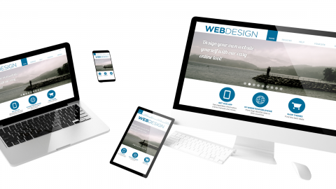
- Responsive design. An overwhelming number of people are now accessing the Web via mobile devices instead of desktop screens. In fact, as of Q2 2018, 63% of all retail website visits were made on a smartphone. This is even more true for developing countries, whose populations skipped over the desktop/laptop stage and went direct to mobile devices as Internet access and smartphones came to their regions. However, a study by Appticles, published in 2017 in Smashing Magazine, stated that the percentage of all sites that are responsive was at just 52.11%. That could be accounted for by the recent explosion in sheer volume of sites since consumer-level content management systems became ubiquitous, as well as the number of sites that were aging and not being maintained. Regardless, it's definitely a convention that should be followed by anyone creating a new website from this point forward.
Other conventions we would recommend in addition to these include such things as
- Terms of Use and Privacy Policies in the footer
- making sure you offer a sitemap as part of the navigation, and
- offering social sharing buttons on any content that may be deemed shareable, especially blog posts and newsroom features.
There are plenty of other conventions, as well as some usage models that have at least become trends, if not yet conventions. Here’s a great article on the difference, and why that’s important.
Next time, we’ll take a look at specific design elements that can help you create a pleasing website user experience.